Hi, I’m Kwennie
-
Data illustrations, charts, maps, motion graphics and other visual stories that explain complex topics. From election results to geopolitics, across print, broadcast and digital.
-
Editorial clients including Nieuwsuur, Dutch broadcasting network NOS, newspapers such as NRC, as well as cultural institutions like the Maritime Museum Amsterdam.
-
International newsrooms and visual teams where there is room to pitch and develop stories independently.
I create visual stories at the intersection of illustration, journalism and data.
visual journalism
-
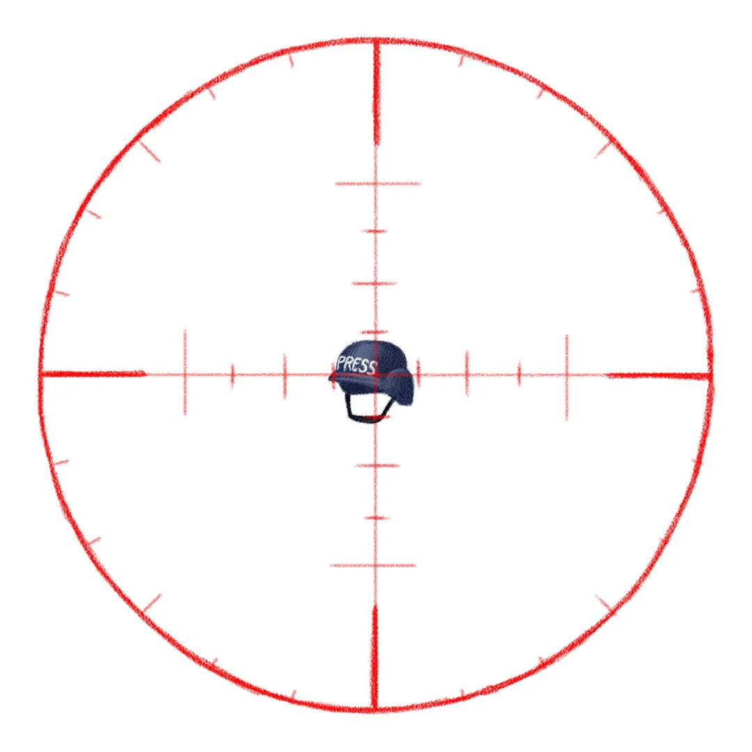
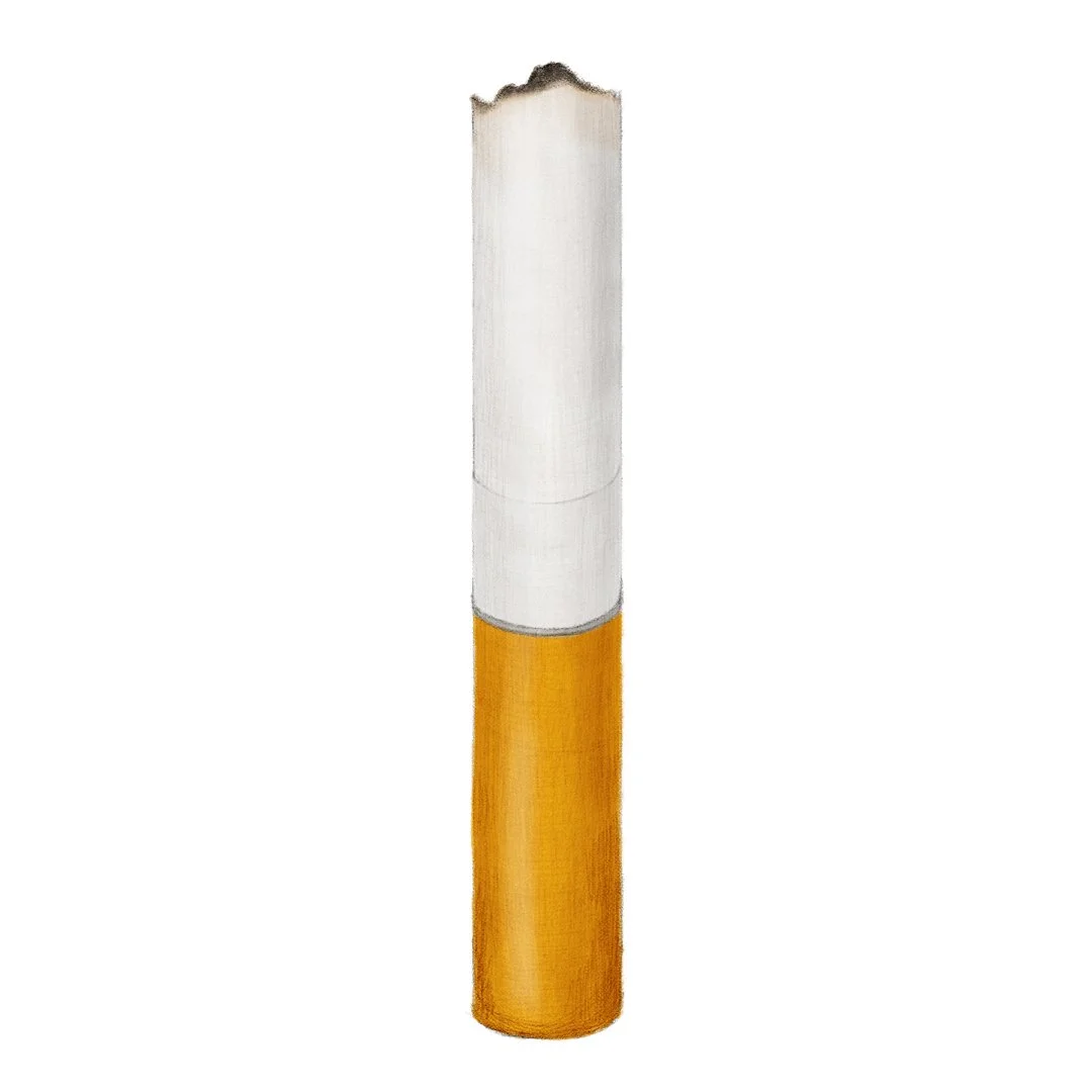
data driven op-ed illustrations
Biweekly illustrations in the op-ed section of Dutch newspaper NRC.
-
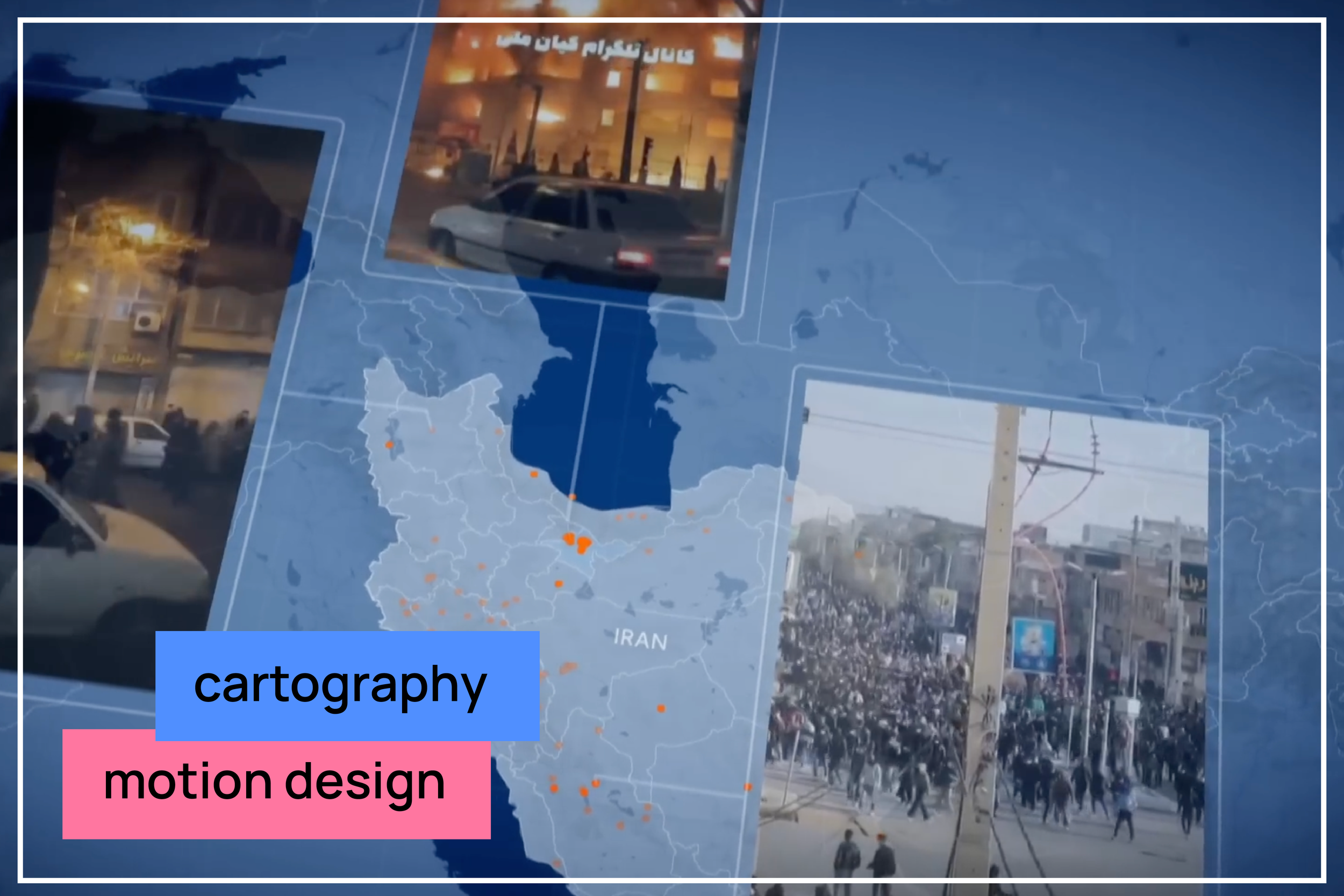
demonstrations in Iran
Animations, maps and graphs for an analysis video on the 2025 Iran demonstrations.
-
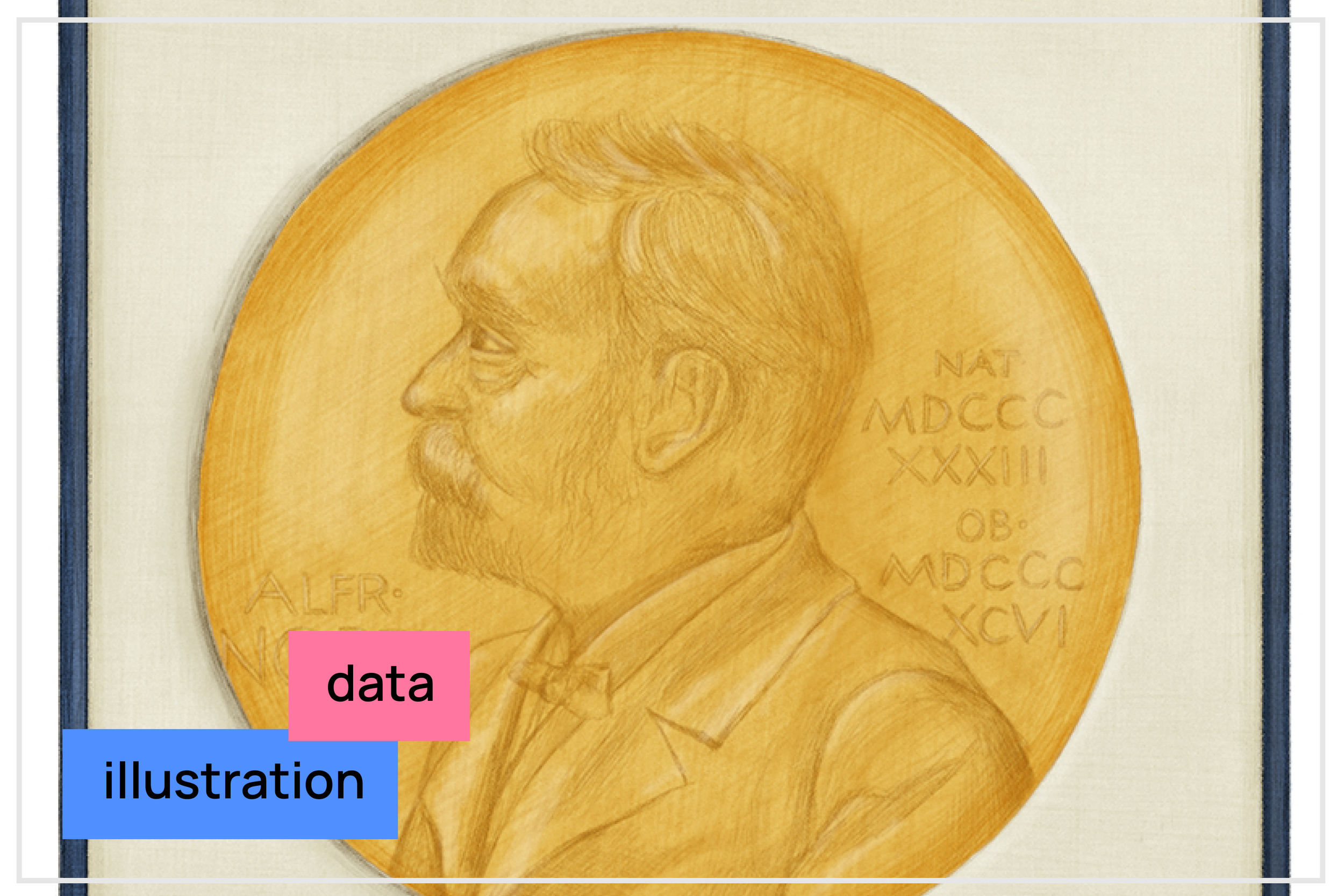
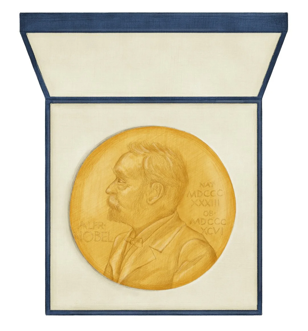
Nobel prize laureates
A full-page data visualization for NRC analyzing Nobel Prize laureates.
-
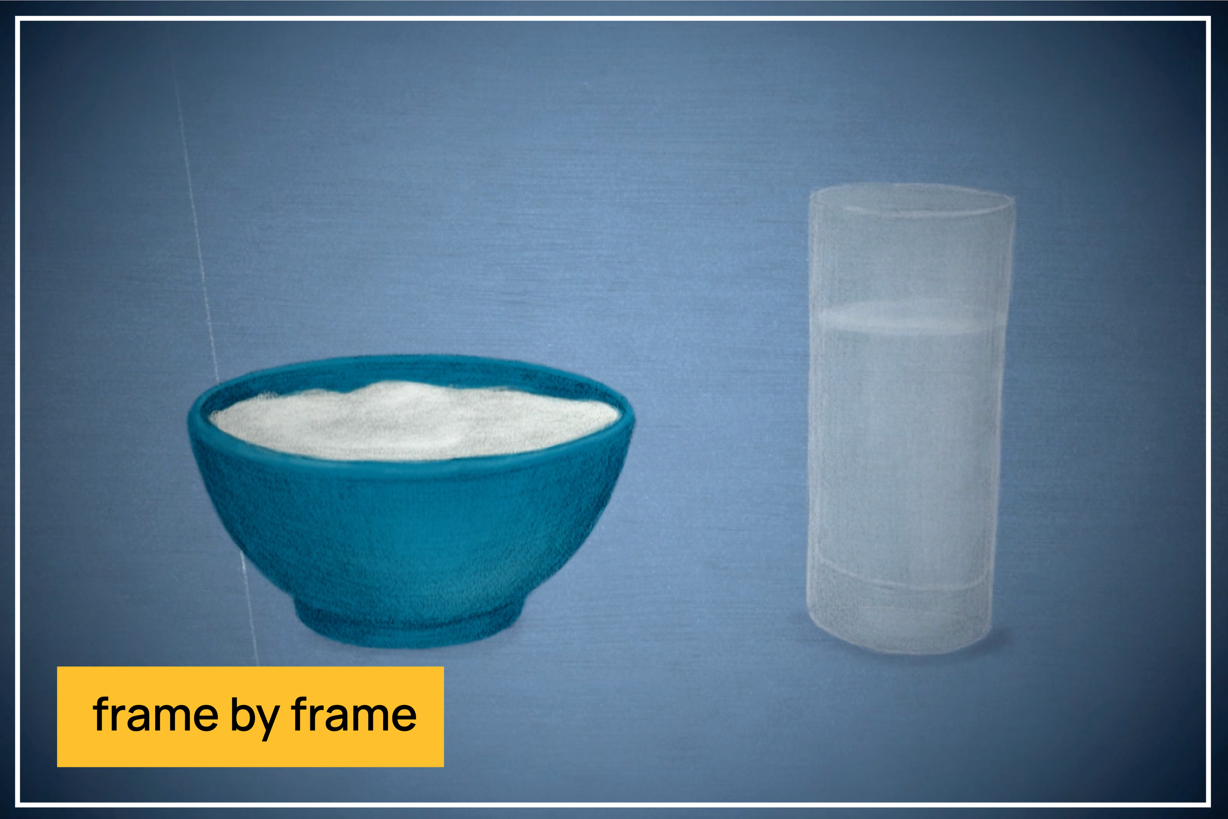
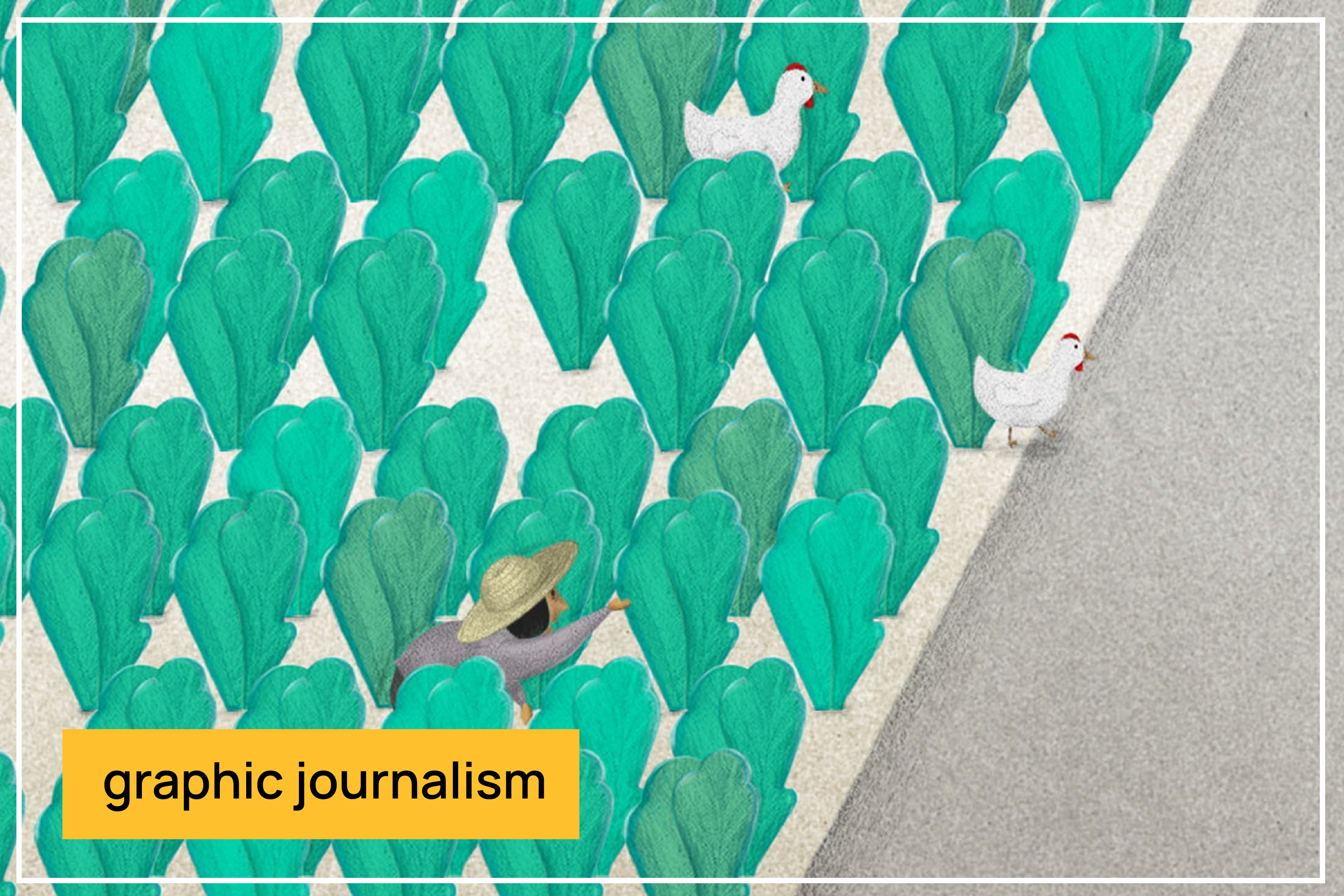
modern slavery
Frame-by-frame animations accompanying investigative reports on modern slavery around the world.
-
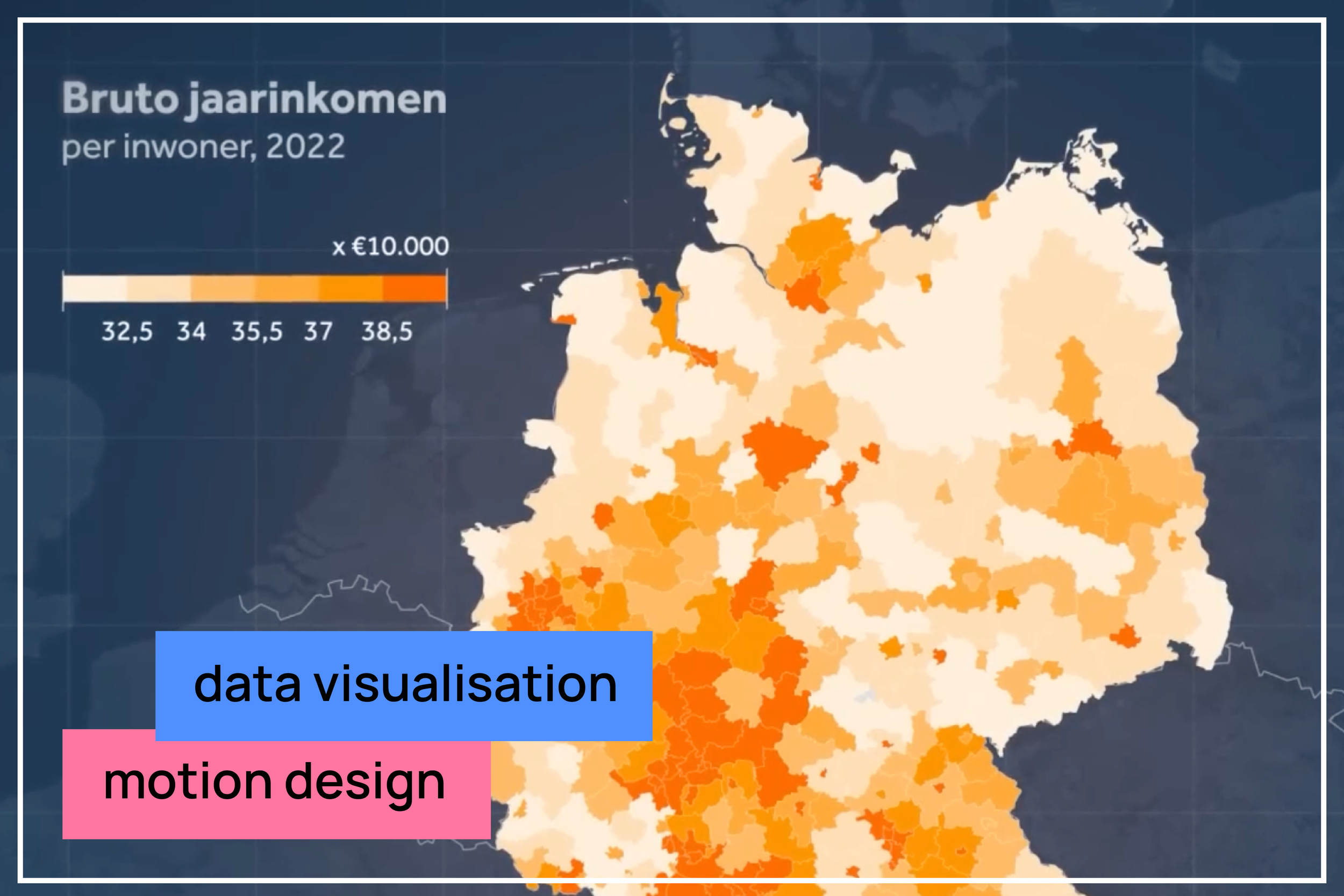
far-right in Germany
Animations, maps, and graphs for an explainer on the German elections, focusing on the rise of the far-right AfD.
-
past, present, future of climate change
Long-form explainer on climate change, showing how interconnected factors influence each other.
-
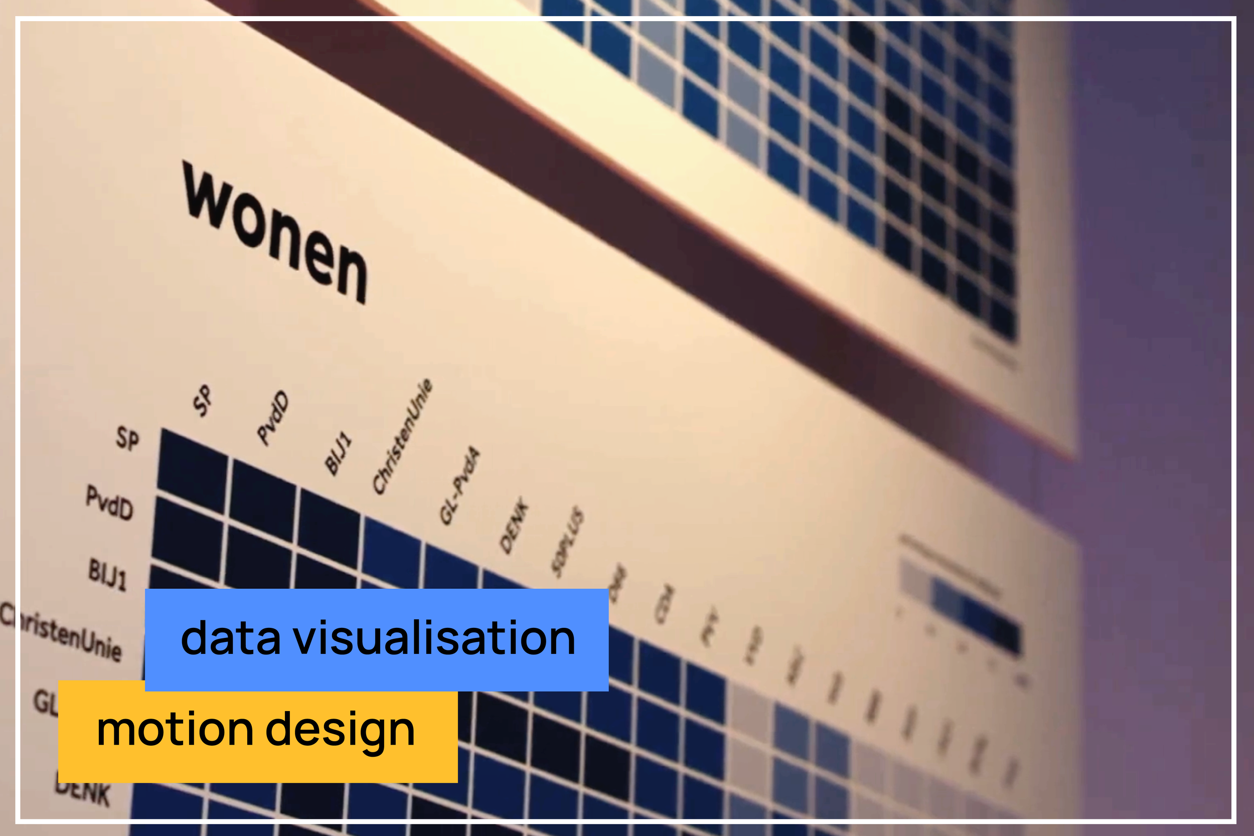
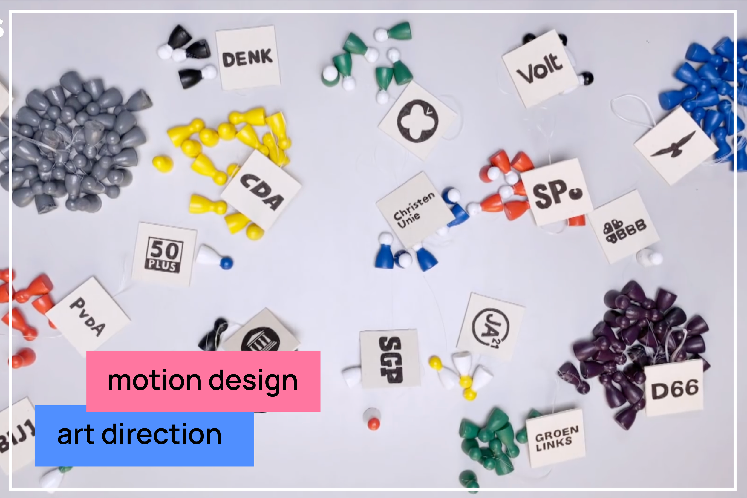
Dutch general elections 2021
Animations, graphs and heat maps for analysis videos leading up to the 2023 Dutch national elections, each focusing on a key political issue.
-
land appropriation
Personal story on how land appropriation in China affected my grandma. - coming soon
-
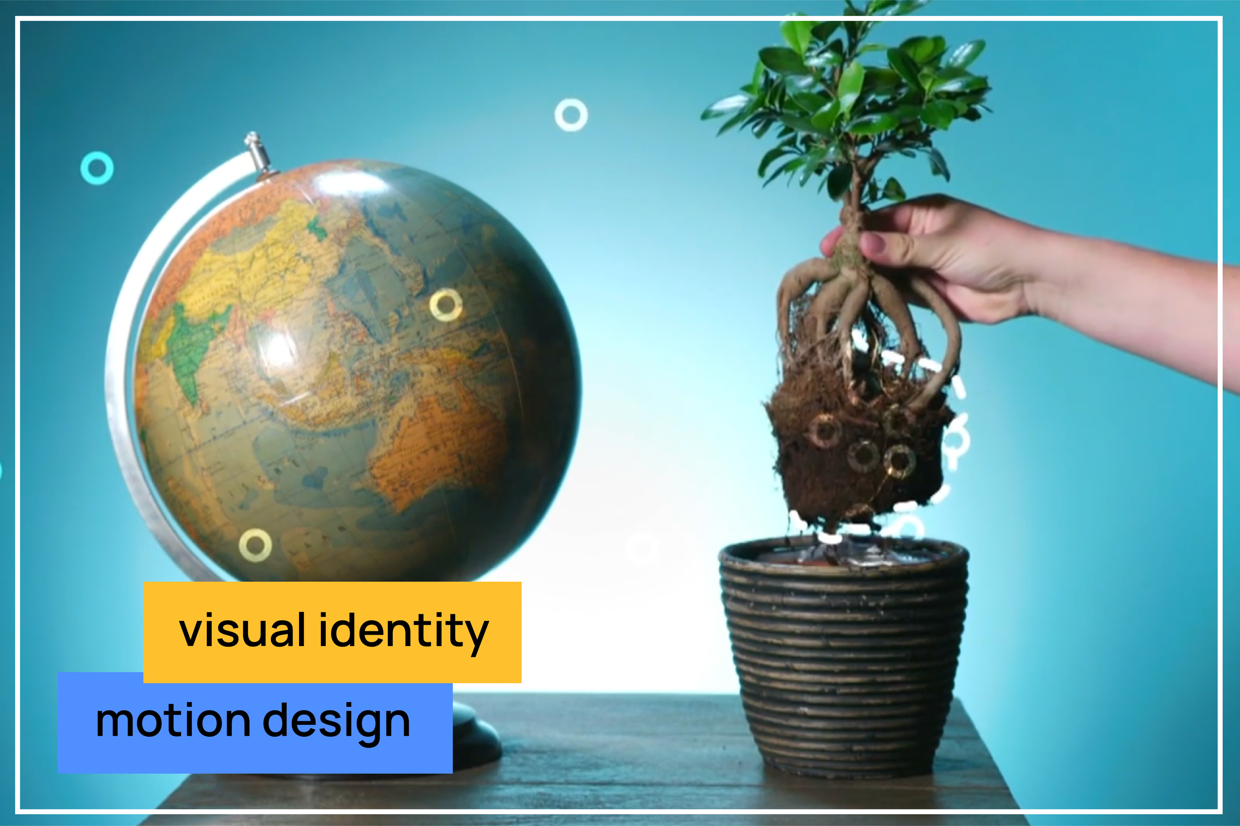
'Uitgezocht'
Visual identity and motion design for a new explainer format within NOS Jeugdjournaal (news for children).
-
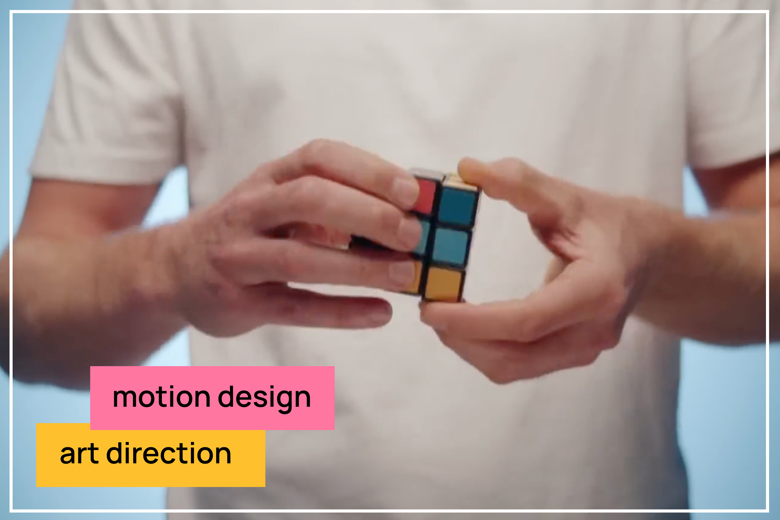
forming a coalition
Explainer video on forming a coalition after the 2021 elections, visualizing coalition possibilities.
-
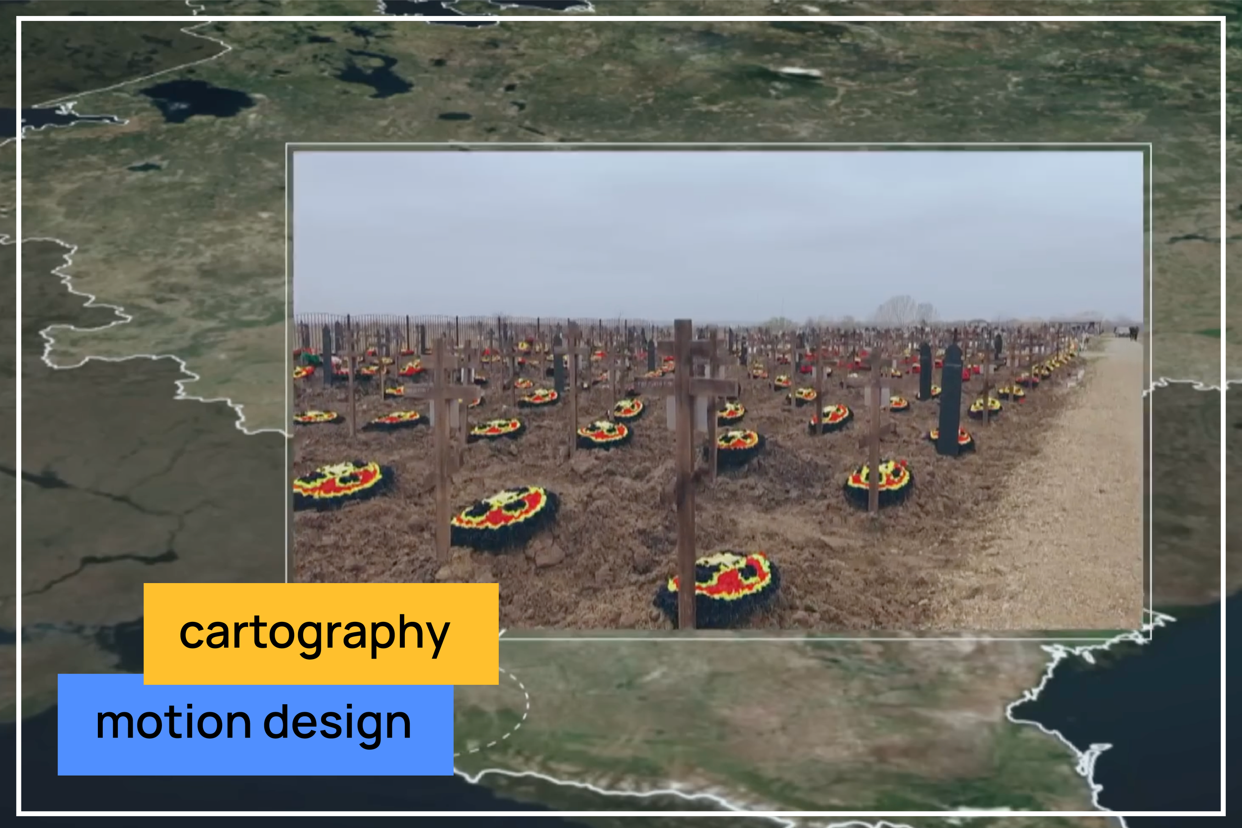
deaths of Wagner soldiers
Animations and maps to help visualise an investigation into casualties within the Wagner Group, tracking recruited fighters who died in the war in Ukraine and were buried in Bakinskaja.
illustration


notes